The Art of Pattern Mixing: How to Style Patterns Properly
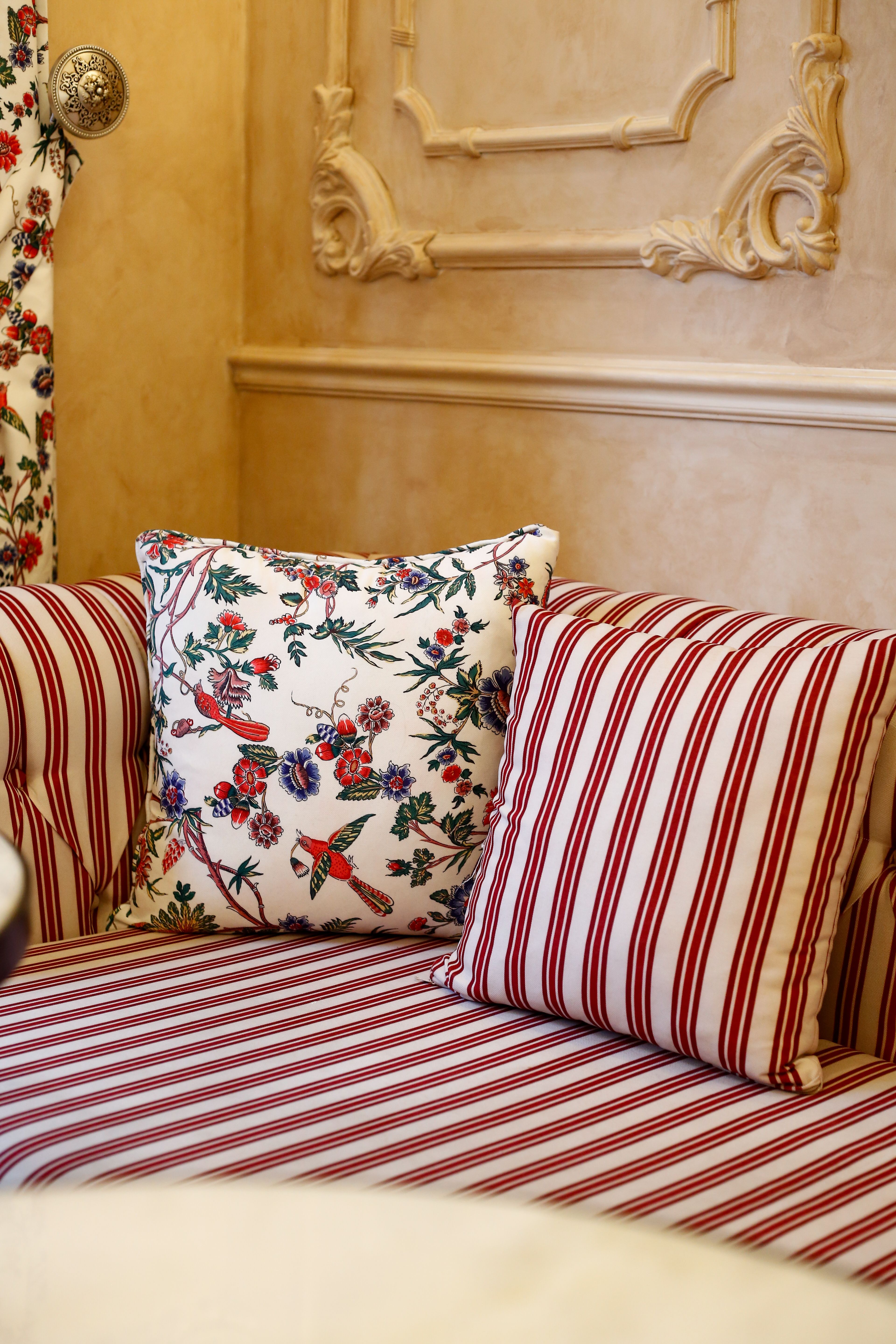
Pattern mixing has a reputation problem. Done badly, it reads as noise and a room shouting instead of speaking. Done well, it is one of the most sophisticated things an interior can do: it introduces movement, personality and depth without ever raising its voice.
The cautionary example is an easy one to reach for. Versailles, in its most opulent state rooms, layers pattern on pattern on pattern, brocade against parquet against gilded relief against tapestry, until the eye has nowhere quiet to land. It is spectacular, and it was built to be. But it is also a useful reminder that pattern mixing without restraint becomes performance rather than atmosphere. For a home, the goal is to show off your confidence rather than the need for spectacle.
So how do you do it?
Here are our tips and tricks to get pattern mixing right.
Pick three to five colors and stick to them. The patterns themselves don't need to match, but their colors do. Choose a small palette in total and repeat it across every pattern in the room, so a stripe and a floral can share a shelf because they're quietly speaking the same color language. The classic 60-30-10 split, a dominant color, a secondary color and a small accent, still holds up as a reliable way to keep a multi-pattern room from feeling uncoordinated. A good starting point: pull three colors directly from one object you already love, a rug, a piece of art, a ceramic vase, and let every pattern choice answer to that palette.
Vary the scale. If every pattern repeats at the same size, the space reads as flat, no matter how well the colors coordinate. Pair one large-scale pattern to lead, a medium one to support, and a small one for detail, so the eye always has somewhere new to land. A wide-set stripe with a smaller, denser floral works well, as long as one of the two clearly dominates.
Choose one hero pattern. The most reliable way to avoid the Versailles effect is to nominate a single hero pattern and let everything else act in a supporting role. A quieter, more graphic pattern such as a stripe is easy to place because it behaves almost like a solid color from across the room, while a busier pattern, like a floral, tends to be the one the space is remembered for. A wide ticking stripe as the hero on a sofa, a small-scale floral in the same colorway on a single cushion, and a plain linen in one of the palette's neutrals on everything else, is a combination that rarely fails.
Let the colors overlap. A room reads as gathered rather than accidental almost always because of color overlap, a thread of the same rust, sage or ink running through two or three different patterns, so the eye registers them as related before it registers them as different.
Add texture, not just pattern. A room that mixes a crisp cotton stripe, a nubby linen floral and a smooth velvet solid will always feel richer than the same three patterns in identical fabrics. Rough against smooth, matte against a little sheen, these contrasts do as much work as pattern scale.
Stop at two or three patterns. Most interior designers land on the same practical ceiling. Solids exist to let the eye rest in between, and a plain linen cushion or unpatterned wool throw does as much work as another print would, simply by giving the pattern around it room to breathe.
Pattern mixing, in other words, is less about how much you can combine and more about how you do it. Choose a hero pattern, find a shared palette, add a little textural contrast and a sense of restraint, and the result won't just be decorated. It will be layered on purpose.
View The Art of Pattern Mixing on our Instagram
Keep reading


.png)
.png)